First Step: Relax.
It’s really pretty simple.
All the hard work is already done. There are only a few small items you should check on with your website, and you'll be good to go.
Search 3 itself works with any existing website using any template. However, it is highly recommended that you follow the simple steps outlined here to verify and update your site. Doing so will ensure you get the most benefit of the Search 3 upgrade.
Next: Give Your Site a Checkup
Every website needs a checkup from time to time. Technology changes. As do consumer preferences.
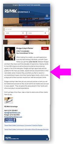
To get the most out of Search 3, you will want every part of your website to be "responsive". That means it will visually respond to whatever device your visitor is using - whether it's a smartphone, a tablet, a laptop or even a wide screen television.
Search 3 gets you 90% of the way there by making all the search functions of your site responsive.
Here's what you need to do to get the last 10%:
- Update Your Site To A Responsive Template (if you haven't already done so)
- Look Over Any Content You Have Added Previously
- Make Sure Your Menu Fits
Step 1: Update Your Site to a Responsive Template
This short video walks you through the process of checking and changing your template, with simple step-by-step instructions.
Step 2: Look Over Any Content You Have Added Previously
With your site now using a responsive template, the next step is to review any custom content pages you may have added to your site.
Again, all the search functions are already responsive, so that section of your SEO pages is good. What you should look at are the pages where you have added content - and in particular, pages that contain large images, tables, videos or other embedded elements which may not be flexible in size.
The easy way to test a page is to bring it up on your laptop, and then, using your mouse, grab the right edge of your browser and drag it to the left until it is tall and skinny, like a smartphone. If the page looks good (pictures have scaled, type is still readable) then everything is good.
Note: Prior to the launch of Search 3, you cannot perform this test by looking at your site on a smartphone. You must use your laptop browser to simulate a smaller display.

Step 3: Make Sure Your Menu Fits
The last step is to look over your menu to make sure it doesn't have more items than can fit on the smaller screens. We recommend 5-6, with 8 as a max.
Also look at any drop-down menus you have - it is best if they fit on the smallest screen your visitors may be using.
If necessary, rearrange and reorganize your menu until it works well on all devices. The following video offers a step-by-step method to convert a long menu (typically of SEO search pages) to a landing page.


